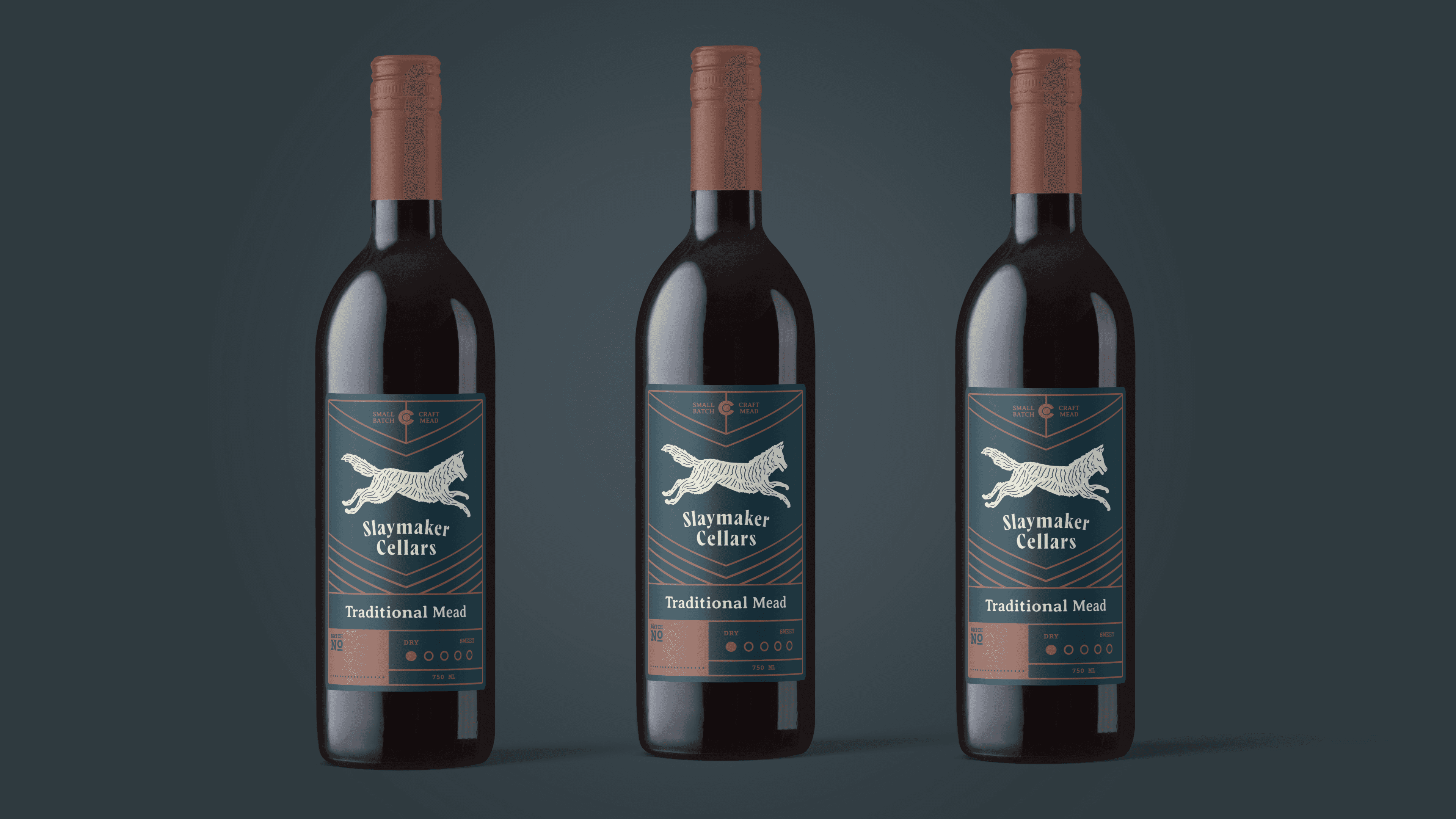

We crafted a visual identity that blends elegance with edge by pulling inspiration from folklore, luxury spirits, and dark, moody atmospheres. At the center is a hand-drawn wolf mark, a subtle nod to Viking culture that feels timeless rather than cliché. We paired it with a unique type system that feels both refined and slightly offbeat, striking a balance between heritage and modernity. On the packaging, we kept things minimal and premium, with a focus on rich textures, clean layouts, and a custom sweetness scale that educates without overwhelming. The result is a brand that stands out on shelf and redefines what mead can look like.
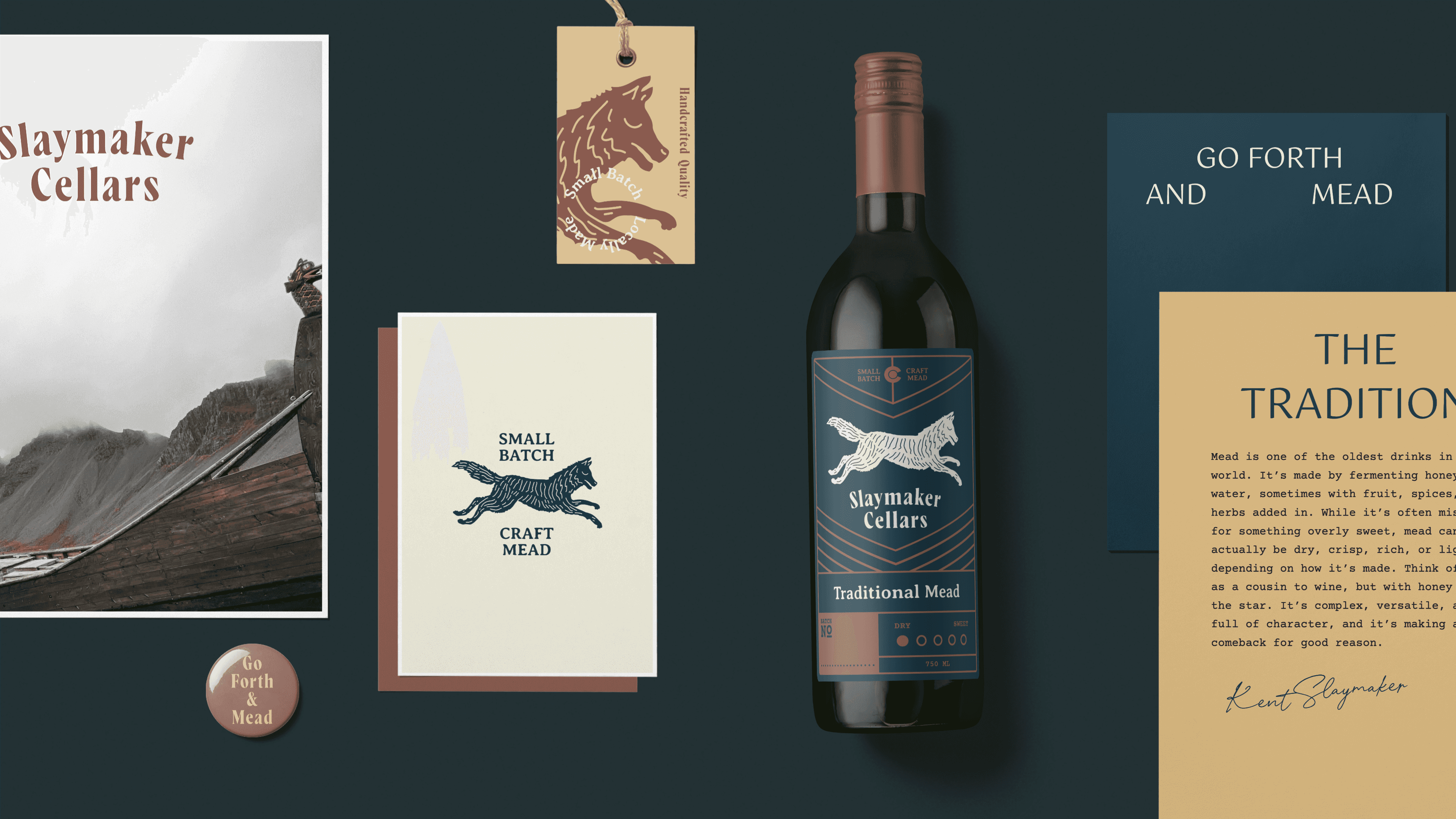
Slaymaker Cellars launched with a bold new identity that challenged expectations and reshaped the perception of mead. The brand quickly gained traction, earned strong shelf presence, and expanded into its own tasting room. With a growing fan base and new product lines like Session Mead hitting the market, Slaymaker continues to carve out a fresh, elevated space in the world of craft beverages.
"Working with Ember was more than just getting a great logo. They took the time to truly understand who we are and what we’re building." - Kent Slaymaker, Slaymaker Cellars
Next projects.
(2016-25©)